« Previous 1 2 3 Next »
Visualizing log and other data
Painting by Numbers
Fudgie
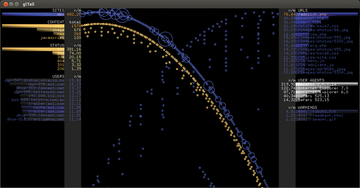
Fudgie [5] is also dedicated to access logs. Its output slightly resembles that of Logstalgia: The hosts listed on the left issue their requests in the form of circles to the middle of the screen (Figure 5). The bigger the circle, the more extensive the request. On the right side of the screen are the requested URLs, which in turn throw a circle into the middle.
All the circles eventually tumble slowly through a funnel at the bottom of the screen. Additionally, Fudgie computes the number of requests made per minute. If so desired, the tool logs into the web server itself and retrieves the logfiles directly from there.
Unlike with Logstalgia, administrators cannot see which request was for which URL or whether it resulted in an error. You can only see, from the circles gathering in the funnel, which host has generated the biggest load on the server with its inquiries. Also, the most frequently requested URL generates the most circles. A very tight beam thus indicates numerous requests made in quick succession that might overload a server.
If you want to try Fudgie, be prepared for a fairly complicated installation. You need a Ruby environment with specific Ruby gems, and you have to create a configuration file in YAML format. On top of this, installing Fudgie on the current crop of distributions means some contortions and knowledge of Ruby.
Ubuntu users will need to install Ruby 1.9, declare this as the standard Ruby system, then remove a version query from the source code version of Fudgie (delete the comma in line 28 and all subsequent characters in the lib/gl_tail.rb file), and install all the gems which Fudgie then successively requests.
At the end of the day, the funnel did not work properly in our lab for this article; all of the circles dropped directly into the abyss. The Fudgie author describes his program code as "terrible," and I would not want to argue with that.
Conky
Reams of small programs that visualize processor activity and system utilization are available on the web and in distribution repositories, in addition to matching widgets or applets for desktop environments. One, however, stands out from the crowd – the popular Conky tool, which is particularly versatile [6].
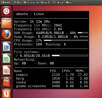
Unlike some of its competitors, Conky lets users influence the way processor activity or usage is displayed directly and configure this themselves. By default, the information appears as numbers, simple bars, or histograms. Conky normally writes its output directly to the desktop – more specifically to the root window (Figure 6). On request, however, Conky will present the information in a separate (transparent) window.
 Figure 6: Conky is not exactly pretty with the simple configuration file that comes with the program.
Admins can give the presentation a lot more pep by tweaking the configuration file: From color schemes to curved bars, almost everything is configurable (Figure 7). Examples abound on the Internet; a post by Pushakr Gaur [7] shows a small gallery with exceptional visuals.
 Figure 7: Conky with an appropriately customized configuration file. Admins will find any number of configuration and tuning tips on the Internet.
Henrik Brix Andersen's brainchild was also pretty smart: The background image he chose is a drawing of his notebook, and he positioned the Conky information with arrows at the right places [8]. Ultimately, these graphics again only contain bar charts with different degrees of curvature and cleverly placed numbers that are more difficult to read in part than their standard counterparts.
In addition to processor utilization, Conky can display and visualize much more system information, including incoming and outgoing network traffic and memory requirements. The tool logs incoming email and even lets you integrate the already aging XMMS audio player. All told, Conky offers more than 250 data sources. For more features and information providers, users can turn to Shell or Lua scripts.
By default, Conky only shows you the current data on the active system. You need to read recorded data with the help of an appropriate script, process the data, and pass it on for visualization by Conky. Conversely, Conky can record the data it displays in a logfile.
cpuplayer
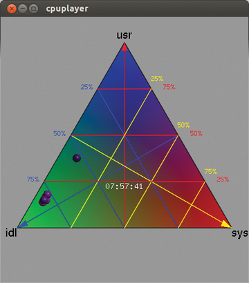
Cpuplayer [9] takes a somewhat different approach: It uses a barycentric coordinate system [10]. Although this might sound complicated, it turns out to be a triangle, with each processor appearing as a dot (Figure 8). If one of the processors is twiddling its thumbs, its point moves to the bottom left corner; if it is working hard, the dot moves up to the top. If system time utilization is high, it sits at the bottom right.
The position in the triangle clearly shows you which processors are busy, the extent of the load, and who is causing it. A colorful grid also allows fairly accurate reading of each load: you only need to determine which small lattice triangle the processor resides in, then follow the grid lines to the edge, and read the scale. The representation of a triangle is a bit unconventional, but after a short adjustment period, it can be read faster and captures the results more accurately, especially compared with the small bar charts used by the other candidates.
Unfortunately, cpuplayer cannot monitor the active system; it visualizes only previous logs, and they must be in a very specific data format. For example, if you have data logged with mpstat, you first need to reformat it using a script of your own. Cpuplayer also only shows the load changes over time: The user has to find out why the kernel is using one processor so heavily all of a sudden.
« Previous 1 2 3 Next »
Buy ADMIN Magazine
Subscribe to our ADMIN Newsletters
Subscribe to our Linux Newsletters
Find Linux and Open Source Jobs
Most Popular
Support Our Work
ADMIN content is made possible with support from readers like you. Please consider contributing when you've found an article to be beneficial.


